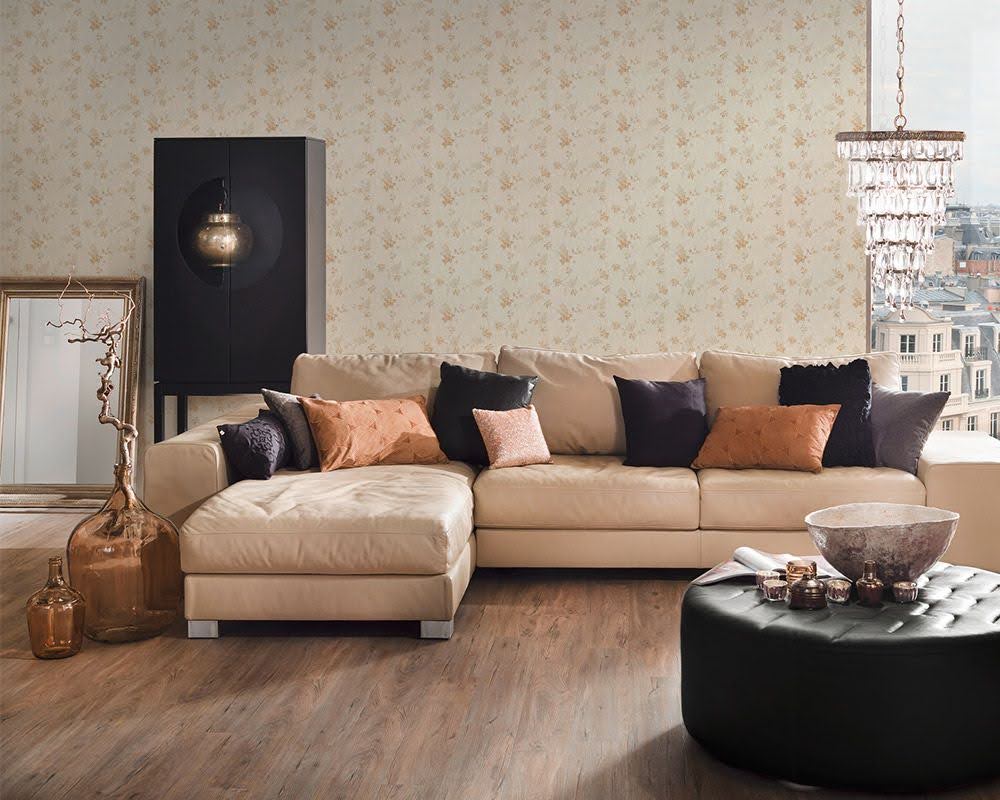
The living room is the heart of most homes—a space designed for relaxation, connection, and welcoming others. Regardless of its size or style, creating a cozy, inviting atmosphere heavily depends on choosing the right paint color. Even the most carefully styled furniture and décor can be overshadowed by a poorly chosen wall color. Selecting a paint shade that feels calming while complementing your aesthetic is key.
To help simplify the decision-making process, Margaret Donaldson, renowned Charleston-based interior designer and founder of MDI Luxury Design, shares the hues you should avoid when painting your living room. From overly stimulating neon shades to stark tones that disrupt a room’s sense of comfort, here are the top paint colors to skip—and smarter alternatives to consider.

Neon Green
When choosing a paint color for your living room, you should avoid ones that are overly attention-grabbing or stimulating. Neon green is a prime example, says Donaldson, as the shade is too bold and commanding for a space meant for rest.
For those drawn to green, Donaldson recommends a more subdued yet impactful alternative. Its rich and earthy undertones offer vibrancy without overpowering your space, blending confidence with a balanced, calming aesthetic.
Hot Pink
While hot pink may be trending thanks to cultural moments like the Barbie movie, Donaldson cautions against using such an energetic shade in your living room. “It’s overly stimulating for a space meant to unwind,” she explains.
Instead, opt for a softer, more muted version of the color. Look to Benjamin Moore’s First Light 2102-70, which delivers a delicate warmth akin to a modern-day neutral. This versatile pastel pink complements a wide range of furnishings and styles while setting a tranquil mood perfect for a cozy living room.

Stark White
Though appealing for its light and airy qualities, stark white often falls flat in living rooms.
Warm whites, on the other hand, strike a balance between clean and cozy. Seek out white tones with yellow, red, or orange undertones to create a softer, more inviting environment. Whites with cool undertones—such as blue, green, or purple—can feel chilly, so avoid those if a gentle ambiance is your goal.
Cool Gray with Blue Undertones
Gray has long been a popular neutral, but not all grays work in every space. Cool grays with blue undertones can feel overly clinical or cold, especially in living rooms with limited natural light. “Testing colors in your space with different lighting conditions is critical,” advises Donaldson.
For a versatile, welcoming gray, Donaldson suggests Sherwin-Williams Agreeable Gray [SW 7029]. Its warm undertones create a balanced and approachable neutral that adapts beautifully to varying light throughout the day.
Lime Yellow
Lime yellow, known for its high-energy brightness, can make even the most stylish living room feel jarring and restless. “Harsh yellows tend to agitate the mind, making it difficult to relax,” says Donaldson.
However, not all yellows are off-limits. Donaldson recommends Benjamin Moore Windham Cream HC-6 for a soft and cheerful feel. This creamy, subdued yellow radiates warmth while providing a cozy backdrop conducive to relaxation and connection.

Choosing the right paint color for your living room is more than simply picking something that catches your eye—it’s about fostering an environment that supports comfort and harmony. By avoiding overly stark, stimulating, or unbalanced shades, and instead opting for colors with warmth and subtlety, you can enhance the beauty and functionality of your living space. Thanks to Margaret Donaldson’s expert guidance, transforming your living room into an elegant and inviting retreat is easier than you might have imagined.